

I have downloaded the RECs 2009 data from eia’s website: https://www.eia.gov/consumption/residential/data/2009/index.php?view=microdata
The motivation is to:
Please read the Notes and Observations throughout the Notebook to understand the approach and flow
Code available on git repo here
The code flow:
%matplotlib inline

import numpy as np
import matplotlib.pyplot as plt
from mpl_toolkits.mplot3d import Axes3D
import pandas as pd
import seaborn as sns
import re

from collections import OrderedDict
from time import time
import sqlite3

from sklearn.preprocessing import StandardScaler
from scipy.linalg import svd
from scipy import stats
from sklearn.decomposition import TruncatedSVD

from sklearn.manifold import TSNE

import warnings
warnings.filterwarnings('ignore')

from IPython.html.widgets import interactive, fixed

sns.set(style="darkgrid", palette="muted")
pd.set_option('display.mpl_style', 'default')
pd.set_option('display.notebook_repr_html', True)
plt.rcParams['figure.figsize'] = 10,6
np.random.seed(0)
cnx = sqlite3.connect('RECs_data/recs2009_public.db')
def scatter_3D(A, elevation=30, azimuth=120):

    maxpts=1000
    fig = plt.figure(1, figsize=(9, 9))
    ax = Axes3D(fig, rect=[0, 0, .95, 1], elev=elevation, azim=azimuth)
    ax.set_xlabel('component 0')
    ax.set_ylabel('component 1')
    ax.set_zlabel('component 2')

    # plot subset of points
    rndpts = np.sort(np.random.choice(A.shape[0], min(maxpts,A.shape[0]), replace=False))
    coloridx = np.unique(A.iloc[rndpts]['TYPEHUQ'], return_inverse=True)
    colors = coloridx[1] / len(coloridx[0])

    sp = ax.scatter(A.iloc[rndpts,0], A.iloc[rndpts,1], A.iloc[rndpts,2]
               ,c=colors, cmap="jet", marker='o', alpha=0.6
               ,s=50, linewidths=0.8, edgecolor='#BBBBBB')

    plt.show()
df_raw = pd.read_csv('RECs_data/recs2009_public.csv')
print(df_raw.shape)
df_raw.head()
(12083, 931)
| DOEID | REGIONC | DIVISION | REPORTABLE_DOMAIN | TYPEHUQ | NWEIGHT | HDD65 | CDD65 | HDD30YR | CDD30YR | ... | SCALEEL | KAVALNG | PERIODNG | SCALENG | PERIODLP | SCALELP | PERIODFO | SCALEFO | PERIODKR | SCALEKER | |
|---|---|---|---|---|---|---|---|---|---|---|---|---|---|---|---|---|---|---|---|---|---|
| 0 | 1 | 2 | 4 | 12 | 2 | 2471.679705 | 4742 | 1080 | 4953 | 1271 | ... | 0 | -2 | -2 | -2 | -2 | -2 | -2 | -2 | -2 | -2 |
| 1 | 2 | 4 | 10 | 26 | 2 | 8599.172010 | 2662 | 199 | 2688 | 143 | ... | 0 | 1 | 1 | 0 | -2 | -2 | -2 | -2 | -2 | -2 |
| 2 | 3 | 1 | 1 | 1 | 5 | 8969.915921 | 6233 | 505 | 5741 | 829 | ... | 0 | 3 | 5 | 3 | -2 | -2 | -2 | -2 | -2 | -2 |
| 3 | 4 | 2 | 3 | 7 | 2 | 18003.639600 | 6034 | 672 | 5781 | 868 | ... | 3 | 3 | 5 | 3 | -2 | -2 | -2 | -2 | -2 | -2 |
| 4 | 5 | 1 | 1 | 1 | 3 | 5999.605242 | 5388 | 702 | 5313 | 797 | ... | 0 | 1 | 1 | 0 | -2 | -2 | -2 | -2 | -2 | -2 |
5 rows × 931 columns
There are ~360 features in the dataset which are just imputation flags for the other features. They are thus creating degeneracy in the data. By a quick visual inspection, we have determined that the names of all the imputation flag variables start with the letter ‘Z’. So now we are gonig to remove those features from our dataset.
Discarded_feature = [x for x in df_raw.columns if x.startswith('Z')]
df = df_raw[[c for c in df_raw.columns.values.tolist() if c not in Discarded_feature]]
df.shape
(12083, 572)
df.to_sql('df_clean', cnx, if_exists='replace', index=None)
Our data is the 2009 RECS (Residential Energy Consumption Survey) data.
This is a set of 12,083 households selected at random using a complex multistage, area-probability sample design. This sample represents 113.6 million U.S. households.
Each household is described by 931 features including type of household, number of appliances, energy consumption in BTU.
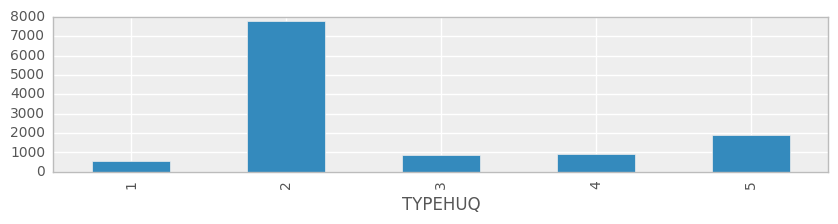
TYPEHUQ is one of the features we are choosing to classify the data. There are 5 different types of housing units in the dataset:
1- Mobile Home 2- Single-Family Detached 3- Single-Family Attached 4- Apartment in Building with 2 - 4 Units 5- Apartment in Building with 5+ Units
Note: All but 9 features are numeric but are on different scales
9 Character features are:
Unique identifier for each respondent
Housing unit in Census Metropolitan Statistical Area or Micropolitan Statistical Area
Housing unit classified as urban or rural by Census
Imputation flag for TOTSQFT
Imputation flag for TOTSQFT_EN
Imputation flag for TOTHSQFT
Imputation flag for TOTUSQFT
Imputation flag for TOTCSQFT
Imputation flag for TOTUCSQFT
Will be eventually remove them from our analysis.
df = pd.read_sql('select * from df_clean', cnx)
Note: We have chosen to understand the impact of “type of housing unit”. Which basically means that we are asking the question: is there a partical pattern across features, which is characterized by the type of housing unit?
ax = df.groupby('TYPEHUQ').size().plot(kind='bar', figsize=(10,2))
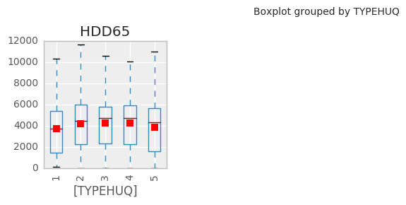
We will determine 21 basic features from the dataset (based on our intution) and create a simple facetted boxplot visualisation of their distributions, showing the values at different scales.
Basically, this is a summarised view of the TYPEHUQ classifications. This will show us how houses of different types TYPEHUQs classifications cluster together.
basic = ['HDD65','CDD65','WALLTYPE','BEDROOMS','TOTROOMS','STOVEN','STOVEFUEL','AMTMICRO','AGERFRI1','ESFRIG',
         'HEATHOME','EQUIPAGE','AUTOHEATNITE','AUTOHEATDAY','TEMPGONE','BTUNGSPH','TOTALBTUCOL',
         'NHSLDMEM','EMPLOYHH','AGEAUD','WINDOWS']

idxdict = OrderedDict()
for b in basic:
    idxdict[b]=[b]
def plot_raw_vals(df, k):
    v = idxdict[k]
    dfg = pd.concat((df[['TYPEHUQ']],df[v]), axis=1)
    ax = dfg.boxplot(by='TYPEHUQ', layout=(2,4), figsize=(10,6)
                    ,showfliers=False, showmeans=True, rot=90)

interactive(plot_raw_vals, df=fixed(df), k=basic)
Clearly we can do better than this for visualization.
Note: Heating degree days are defined relative to a base temperature—the outside temperature above which a building needs no heating. One HDD means that the temperature conditions outside the building were equivalent to being below a defined threshold comfort temperature inside the building by one degree for one day. Thus heat has to be provided inside the building to maintain thermal comfort.Heating degree days are defined relative to a base temperature—the outside temperature above which a building needs no heating.
We want to reduce the dimensionality of the problem to make it more manageable, but at the same time we want to preserve as much information as possible. As a preprocessing step, let’s start with normalizing the feature values so they are all in range[0,1] - this makes comparisons simpler and allows next steps for Singular Value Decomposition.
We are going to remove the following two features in order to convert the whole data into numeric values. These are the only three features left in our dataset with string/character values. Otherwise, they are going to cause trouble in implementing other functions!
We would also like to make sure that there are no blanks in our dataset, if so then we have to fill them with zero.
del df['METROMICRO']
del df['UR']
del df['DOEID']

#Replacing NaN values in the dataset with 0 so that the standardization and normalization functions do not choke
df.fillna(0,inplace=True)
Normalization/Standardization: This step is very important when dealing with parameters of different units and scales. All parameters should have the same scale for a fair comparison between them because some data mining techniques use the Euclidean distance. Two methods well methods for rescaling data are: + Normalization - scales all numeric variables in the range [0,1]. + Standardization - transforms the data to have zero mean and unit variance. There are drawbacks associated with both the methods: + If outliers exist in the dataset then normalizing the data will certainly scale the “normal” data to a very small interval. Generally, most of data sets have outliers! + When using standardization, the new data aren’t bounded (unlike normalization).
Note: we are removing the outliers in the next step for overcoming the above mentioned drawback with normalization
for c in df.columns:
    df_new = df[np.abs(df[c]-df[c].mean())<=(3*df[c].std())]
df_new.head()
| REGIONC | DIVISION | REPORTABLE_DOMAIN | TYPEHUQ | NWEIGHT | HDD65 | CDD65 | HDD30YR | CDD30YR | Climate_Region_Pub | ... | SCALEEL | KAVALNG | PERIODNG | SCALENG | PERIODLP | SCALELP | PERIODFO | SCALEFO | PERIODKR | SCALEKER | |
|---|---|---|---|---|---|---|---|---|---|---|---|---|---|---|---|---|---|---|---|---|---|
| 0 | 2 | 4 | 12 | 2 | 2471.679705 | 4742 | 1080 | 4953 | 1271 | 4 | ... | 0 | -2 | -2 | -2 | -2 | -2 | -2 | -2 | -2 | -2 |
| 1 | 4 | 10 | 26 | 2 | 8599.172010 | 2662 | 199 | 2688 | 143 | 5 | ... | 0 | 1 | 1 | 0 | -2 | -2 | -2 | -2 | -2 | -2 |
| 2 | 1 | 1 | 1 | 5 | 8969.915921 | 6233 | 505 | 5741 | 829 | 1 | ... | 0 | 3 | 5 | 3 | -2 | -2 | -2 | -2 | -2 | -2 |
| 3 | 2 | 3 | 7 | 2 | 18003.639600 | 6034 | 672 | 5781 | 868 | 1 | ... | 3 | 3 | 5 | 3 | -2 | -2 | -2 | -2 | -2 | -2 |
| 4 | 1 | 1 | 1 | 3 | 5999.605242 | 5388 | 702 | 5313 | 797 | 1 | ... | 0 | 1 | 1 | 0 | -2 | -2 | -2 | -2 | -2 | -2 |
5 rows × 569 columns
df_normalized=df
colNum=1
totalCols=len(df.columns)
for col in df.columns:
    minOfCol=df[col].min()
    maxOfCol=df[col].max()
    df_normalized[col]=(df_normalized[col]-minOfCol)/(maxOfCol-minOfCol)
    #print("Normalized column {} of {}".format(colNum,totalCols))
    colNum=colNum+1
df_normalized.head()
df.fillna(0,inplace=True)
df_normalized.head()
| REGIONC | DIVISION | REPORTABLE_DOMAIN | TYPEHUQ | NWEIGHT | HDD65 | CDD65 | HDD30YR | CDD30YR | Climate_Region_Pub | ... | SCALEEL | KAVALNG | PERIODNG | SCALENG | PERIODLP | SCALELP | PERIODFO | SCALEFO | PERIODKR | SCALEKER | |
|---|---|---|---|---|---|---|---|---|---|---|---|---|---|---|---|---|---|---|---|---|---|
| 0 | 0.333333 | 0.333333 | 0.423077 | 0.25 | 0.020939 | 0.378603 | 0.197080 | 0.371122 | 0.237260 | 0.75 | ... | 0.0 | 0.0 | 0.000000 | 0.0 | 0.0 | 0.0 | 0.0 | 0.0 | 0.0 | 0.0 |
| 1 | 1.000000 | 1.000000 | 0.961538 | 0.25 | 0.085234 | 0.212535 | 0.036314 | 0.201409 | 0.026694 | 1.00 | ... | 0.0 | 0.6 | 0.428571 | 0.4 | 0.0 | 0.0 | 0.0 | 0.0 | 0.0 | 0.0 |
| 2 | 0.000000 | 0.000000 | 0.000000 | 1.00 | 0.089124 | 0.497645 | 0.092153 | 0.430166 | 0.154751 | 0.00 | ... | 0.0 | 1.0 | 1.000000 | 1.0 | 0.0 | 0.0 | 0.0 | 0.0 | 0.0 | 0.0 |
| 3 | 0.333333 | 0.222222 | 0.230769 | 0.25 | 0.183914 | 0.481756 | 0.122628 | 0.433163 | 0.162031 | 0.00 | ... | 1.0 | 1.0 | 1.000000 | 1.0 | 0.0 | 0.0 | 0.0 | 0.0 | 0.0 | 0.0 |
| 4 | 0.000000 | 0.000000 | 0.000000 | 0.50 | 0.057957 | 0.430180 | 0.128102 | 0.398097 | 0.148777 | 0.00 | ... | 0.0 | 0.6 | 0.428571 | 0.4 | 0.0 | 0.0 | 0.0 | 0.0 | 0.0 | 0.0 |
5 rows × 569 columns
scipy svd method)Degeneracy means having some of the features with perfect mutual coorelations, in the dataset. Ideally a dataset is made up of all the features, which contain new information but in real-life data collection processes (especially in our RECS dataset, their might be some features with coorelated information), their might be some degeneracy in the data.
Let’s look at it with a simple example, a dataset with the measurements of circular tabletops - radious and area - we know that the radious feature would perfectly describe the area feature, i.e. the features would be degenerate.In contrast, if we had two features in a dataset of human body measurements height and weight, we anticipate that whilst there will be a positive corrolation, the height feature cannot perfectly describe the weight feature.
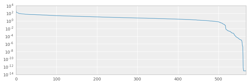
Singular Value Decomposition (SVD) is a matrix factorization commonly used in signal processing and data compression. The m x n matrix $\mathbf{M}$ can be represented as a combination of rotation and scaling matrices $\mathbf{M} = \mathbf{U} \boldsymbol{\Sigma} \mathbf{V}^*$.
Here we will use the svd function in the scipy package to calculate the SVD and observe the singular values $\boldsymbol{\Sigma}$; if any are very close to zero then we have some degeneracy in the full dataset which we should definitely try to remove or avoid.
u, s, vt = svd(df_normalized)
ax = pd.Series(s).plot(figsize=(10,3), logy=True)
print('{} SVs are NaN'.format(np.isnan(s).sum()))
print('{} SVs are less than 1e-12'.format(len(s[s< 1e-12])))
0 SVs are NaN
8 SVs are less than 1e-12
print(type(s))
np.size(s)
<class 'numpy.ndarray'>


569
+ We seem to have some degeneracy in the data which is means the dataset is not so well-behaved. However, looking at the size of the singular value ndarray (which is 569), having zero NaN SVs and only 8 less than 1e-12 SVs still gives us confidence to move ahead with the dataset.
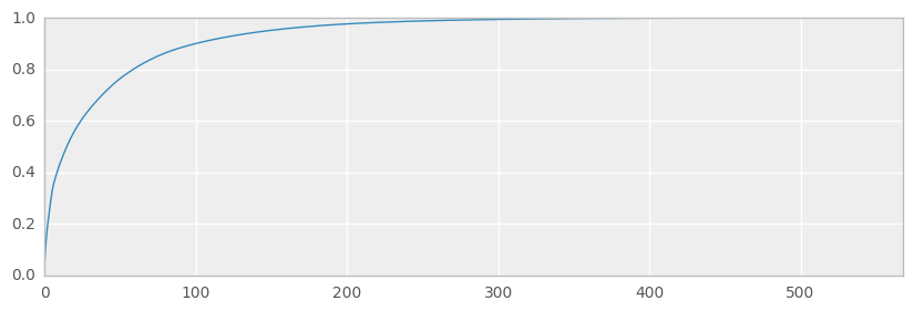
idx = ~np.isnan(s)
xtrans = np.dot(u[:,idx], np.diag(s[idx]))
expvar = np.var(xtrans, axis=0)
fullvar = np.var(df_normalized, axis=0)
expvarrat = expvar/fullvar.sum()
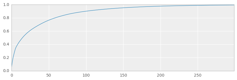
ax = pd.Series(expvarrat.cumsum()).plot(kind='line', figsize=(10,3))
print('Variance preserved by first 300 components == {:.2%}'.format(expvarrat.cumsum()[300]))
print('Variance preserved by first 50 components == {:.2%}'.format(expvarrat.cumsum()[50]))
Variance preserved by first 300 components == 99.43%
Variance preserved by first 50 components == 76.48%
We’ll use SVD to reduce the dataset slightly - removing near-degeneracy, trying to preserve variance and thus replicating what we might do in the real-world prior to running machine learning algorithms such as CART and clustering etc.
scikit-learn TruncatedSVD methodWe are using the TruncatedSVD method in the scikit-learn package (Truncated-SVD is a quicker calculation, and using scikit-learn is more convenient and consistent with our usage elsewhere) to transform the full dataset into a representation using the top 300 components, thus preserving variance in the data but using fewer dimensions/features to do so. This has a similar effect to Principal Component Analysis (PCA) where we represent the original data using an orthogonal set of axes rotated and aligned to the variance in the dataset.
Note: we are using 300 as the number of features in the reduction process because it’s just a nice round number(!) which preserves a lot of variance (~99%) and is still too large to easily visualise, necessitaing the use of t-SNE.
ncomps = 300
svd = TruncatedSVD(n_components=ncomps)
svd_fit = svd.fit(df_normalized)
Y = svd.fit_transform(df_normalized)
ax = pd.Series(svd_fit.explained_variance_ratio_.cumsum()).plot(kind='line', figsize=(10, 3))
print('Variance preserved by first 300 components == {:.2%}'.format(svd_fit.explained_variance_ratio_.cumsum()[-1]))
Variance preserved by first 300 components == 99.41%
For convenience, we’ll create a dataframe specifically for these top 300 components.
dfsvd = pd.DataFrame(Y, columns=['c{}'.format(c) for c in range(ncomps)], index=df.index)
print(dfsvd.shape)
dfsvd.head()
(12083, 300)
| c0 | c1 | c2 | c3 | c4 | c5 | c6 | c7 | c8 | c9 | ... | c290 | c291 | c292 | c293 | c294 | c295 | c296 | c297 | c298 | c299 | |
|---|---|---|---|---|---|---|---|---|---|---|---|---|---|---|---|---|---|---|---|---|---|
| 0 | 10.948964 | -2.553164 | -1.320175 | -0.332661 | 0.411241 | -0.718791 | -1.201730 | 0.928392 | -1.340734 | 0.000100 | ... | -0.013741 | -0.032598 | -0.041036 | -0.018530 | 0.032596 | -0.014922 | -0.018448 | 0.020847 | -0.023385 | -0.031810 |
| 1 | 9.884151 | 0.755475 | 0.712976 | -1.156621 | -0.582364 | -0.396438 | 1.278685 | -0.521564 | 0.136853 | -0.009553 | ... | 0.012322 | 0.022616 | -0.008085 | -0.009435 | -0.004407 | 0.019001 | 0.004109 | 0.029041 | 0.007088 | 0.012069 |
| 2 | 7.234780 | 3.243273 | 1.911465 | -1.155650 | -0.881678 | -0.965843 | -1.188896 | -0.130988 | 0.739985 | -0.311060 | ... | -0.031791 | 0.019634 | 0.003412 | 0.007167 | -0.023518 | 0.026323 | 0.047914 | -0.009729 | -0.047670 | 0.020982 |
| 3 | 10.251207 | -1.116670 | -0.160277 | -1.019178 | 0.248752 | 0.372991 | -0.089327 | 1.095080 | 0.206730 | 0.678957 | ... | -0.036385 | 0.047064 | 0.023988 | -0.022711 | 0.143745 | 0.092064 | 0.032410 | 0.007146 | 0.014613 | -0.061458 |
| 4 | 9.003233 | 0.464212 | 1.791192 | 0.851937 | -0.460342 | -1.239563 | -0.011559 | -0.362750 | -0.680125 | 1.381440 | ... | -0.004690 | -0.023774 | -0.024291 | 0.017820 | 0.019436 | -0.014808 | 0.013990 | -0.018917 | -0.018455 | 0.018301 |
5 rows × 300 columns
dfsvd.to_sql('df_svd',cnx,if_exists='replace', index=None)
Lets attempt to visualise the data with the compressed dataset, represented by the top 300 components of an SVD.
dfsvd = pd.read_sql('select * from df_svd', cnx)
svdcols = [c for c in dfsvd.columns if c[0] == 'c']

df = pd.read_sql('select * from df_clean', cnx)
Pairs-plots are a simple representation using a set of 2D scatterplots, plotting each component against another component, and coloring the datapoints according to their classification (Type of housing units: TYPEHUQ).
plotdims = 5
ploteorows = 1
dfsvdplot = dfsvd[svdcols].iloc[:,:plotdims]
dfsvdplot['TYPEHUQ']=df['TYPEHUQ']
ax = sns.pairplot(dfsvdplot.iloc[::ploteorows,:], hue='TYPEHUQ', size=1.8)
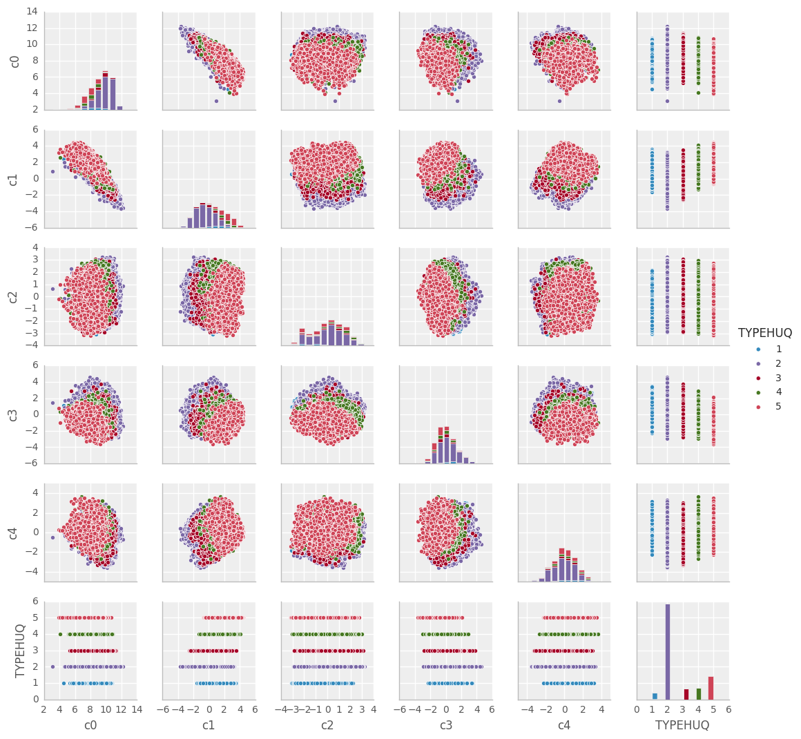
TYPEHUQ 2 and TYPEHUQ 5 seem to predominate hidding away the information related to other TYPEHUQsTYPEHUQ 1, TYPEHUQ 3 and TYPEHUQ 4 are really hard to seeAs an alternative to the pairs-plots, we could view a 3D scatterplot, which at least lets us see more dimensions at once and possibly get an interactive feel for the data
dfsvd['TYPEHUQ'] = df['TYPEHUQ']
interactive(scatter_3D, A=fixed(dfsvd), elevation=30, azimuth=120)
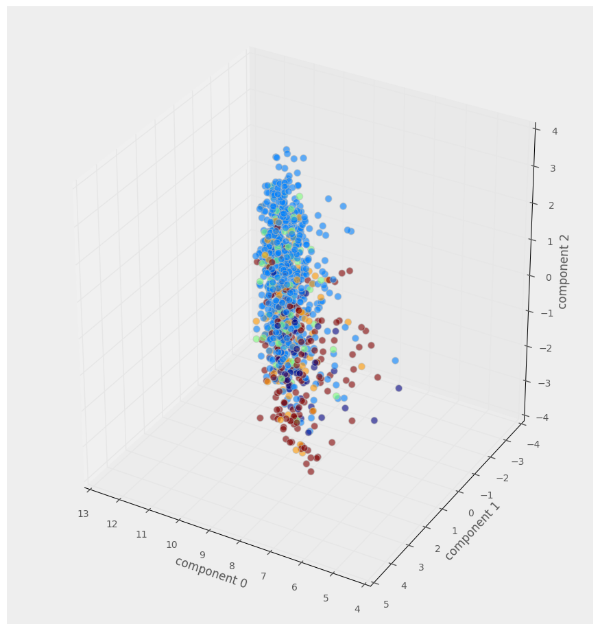
We clearly need a better way to visualise the ~12000 datapoints and their 300 dimensions
Finally we’re ready for the entree of this Notebook: t-SNE Manifold Learning.
t-SNE is a technique for probabilistic dimensionality reduction, developed within the last 10 years and with wider reception in the last 2-3 years, lots of detail at https://lvdmaaten.github.io/tsne/.
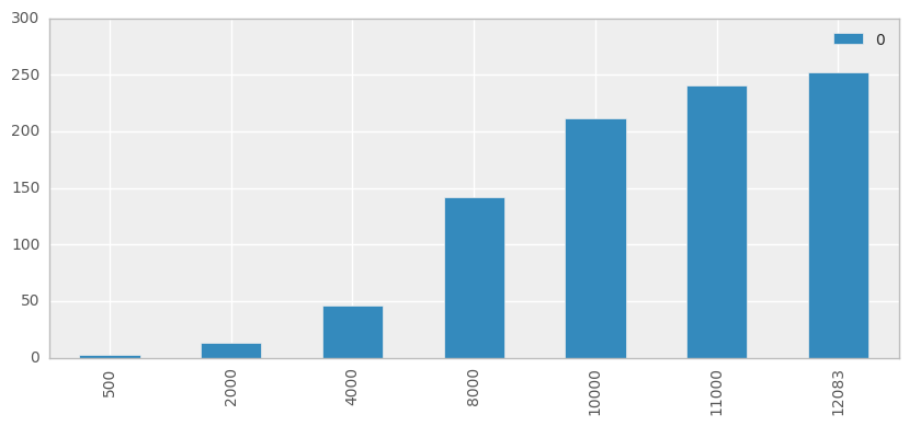
We will use the basic implementation available in scikit-learn which has O(n^2) complexity. Ordinarily this prohibits use on real-world datasets (and we would instead use the Barnes-Hut implementation O(n*log(n))), but for out 675 datapoints it’s no problem.
We will, however, quickly demonstrate the scaling issue:
rowsubset = [500,2000,4000,8000,10000,11000,12083]
tsne = TSNE(n_components=2, random_state=0)
runs = np.empty((len(rowsubset),1))

for i, rows in enumerate(rowsubset):
    t0 = time()
    Z = tsne.fit_transform(dfsvd.iloc[:rows,:][svdcols])
    runs[i] = time() - t0

ax = pd.DataFrame(runs, index=rowsubset).plot(kind='bar', logy=False, figsize=(10,4))
Firstly we’ll calcualte the t-SNE 2D representation for our 300D dataset, and view the results without coloring the classes.
Z = tsne.fit_transform(dfsvd[svdcols])
dftsne = pd.DataFrame(Z, columns=['x','y'], index=dfsvd.index)
ax = sns.lmplot('x', 'y', dftsne, fit_reg=False, size=8
                ,scatter_kws={'alpha':0.7,'s':60})
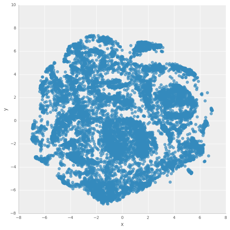
Now let’s view the t-SNE representation with TYPEHUQ classification class labels…
dftsne['TYPEHUQ'] = df['TYPEHUQ']
g = sns.lmplot('x', 'y', dftsne, hue='TYPEHUQ', fit_reg=False, size=8
                ,scatter_kws={'alpha':0.7,'s':60})
g.axes.flat[0].set_title('Scatterplot of a 300D dataset reduced to 2D using t-SNE')
<matplotlib.text.Text at 0x7f756fdd5f60>
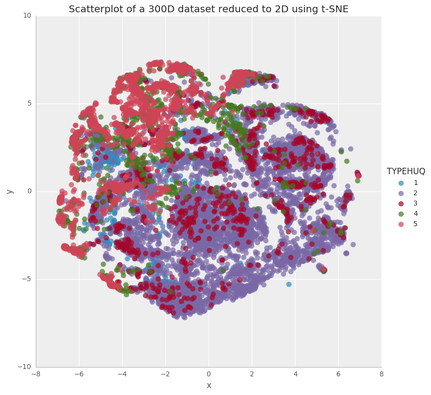
This is quite interesting way of visualizing the RECS data. The above plot shows us that the type of housing unit alone doesn’t classify/categorize the households for their energy consumption patterns. Nonetheless, there is a good degree of clustering for Type 2 (purple) and Type 5 (Pink) houses.
We have analyzed the RECS 2009 dataset in the following steps: